Responsive Design in Canvas Apps & Custom Pages
With Custom Pages and Canvas Apps, there is a way to design custom Low Code applications from a blank page for the Power Platform. These kinds of apps require some thought to be put into achieving a responsive layout. By default, the designer puts an absolute number to most of the heights and widths. In this article, I share my key takeaways to designing responsive Canvas Apps. These of course also apply for Custom Pages that bring the possibilities of Canvas Apps into Model-driven apps.
Mobile vs bigger screens (or tablets) - and start from there
At first, it is important to understand how your app will be (mainly) used: on mobile or bigger screens (like tablets or desktops). Although the apps can have a responsive layout, it is always easier to start with the screen dimensions that most users have. So ask yourself: how will your app be used? Especially for Canvas Apps you need to decide on the basic layout when creating the app. Everything else can be configured later in the display settings.
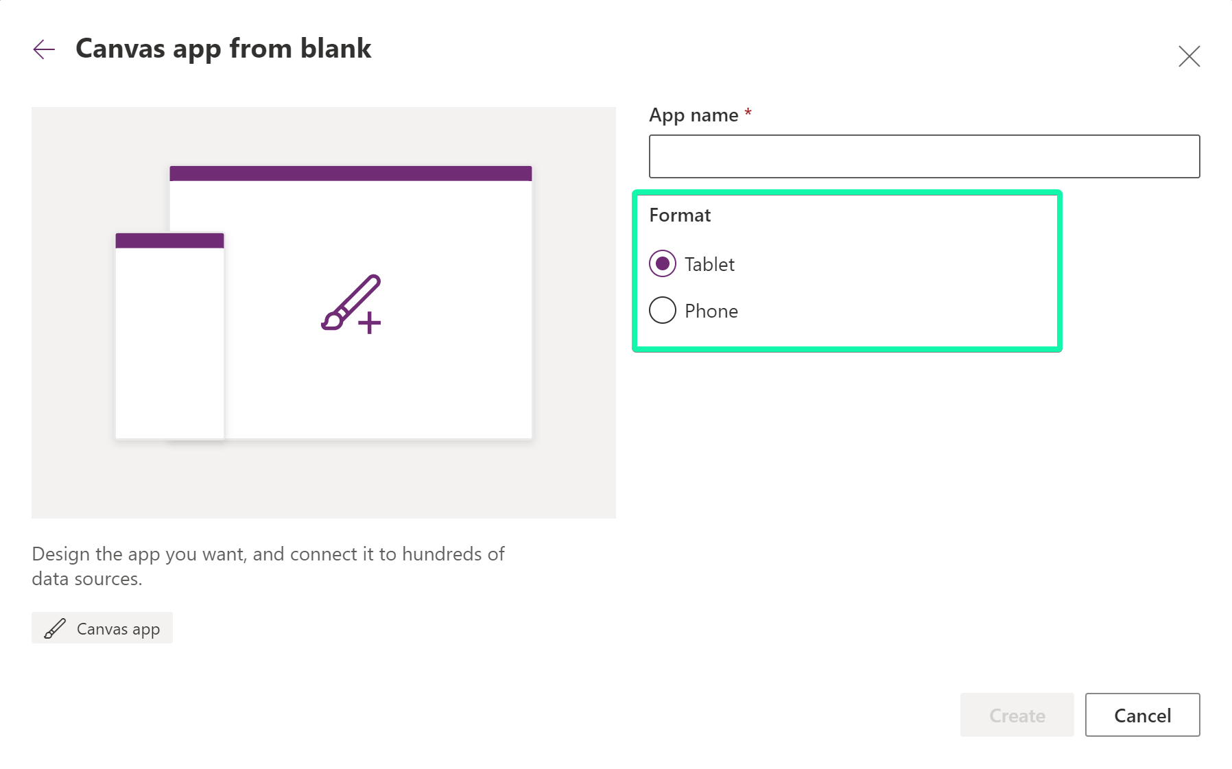
Set the correct display settings
In the designer, you have a couple of display settings you can specify for your app.
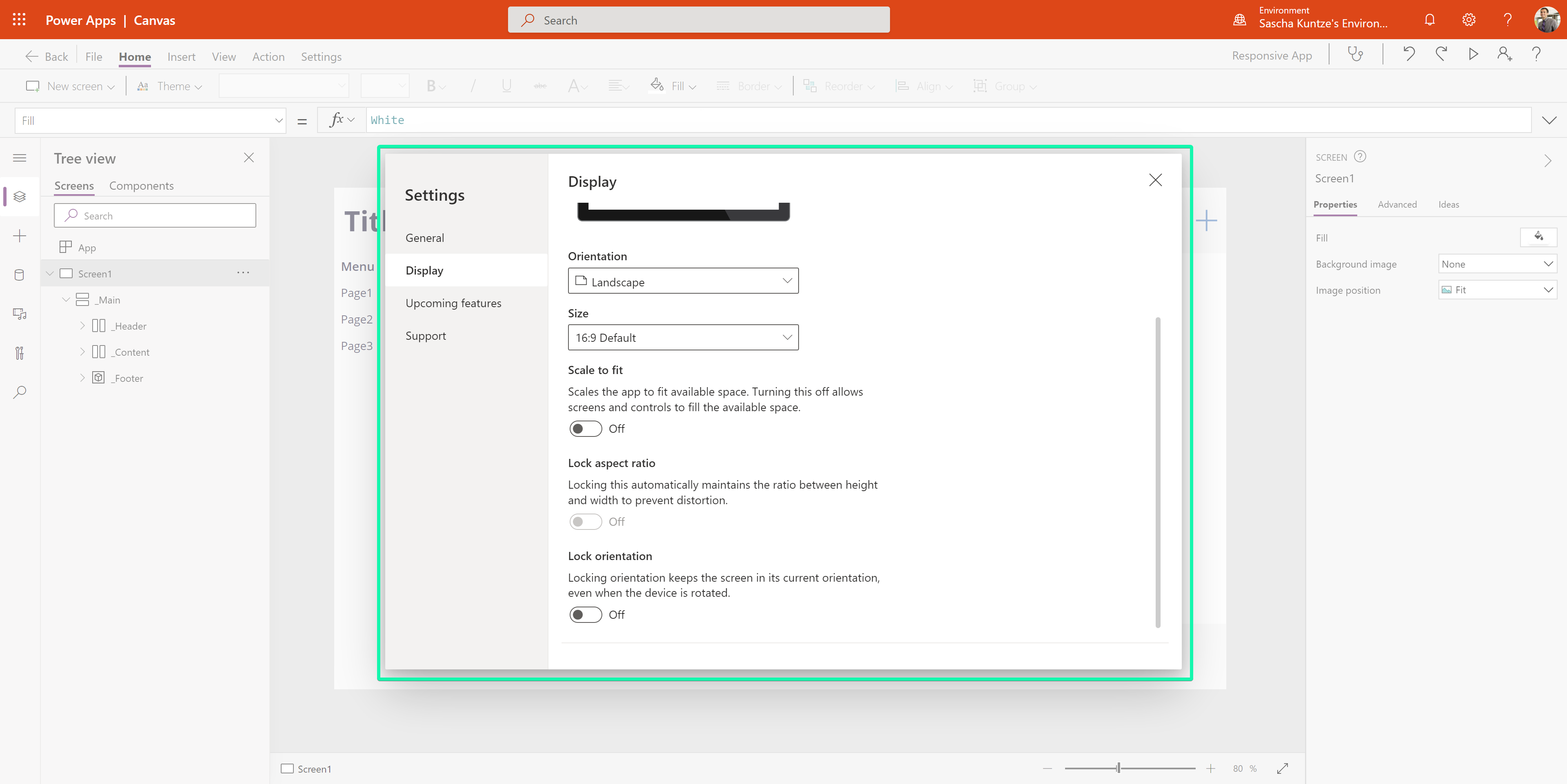
Changing these settings can have an impact on your specified dimensions on elements or containers.
Check out the docs for more details here!
Use containers (a lot)
Using containers is key for every responsive layout. Nearly everything needs to be wrapped inside a container. There are three main types of containers that can be nested depending on your requirements.
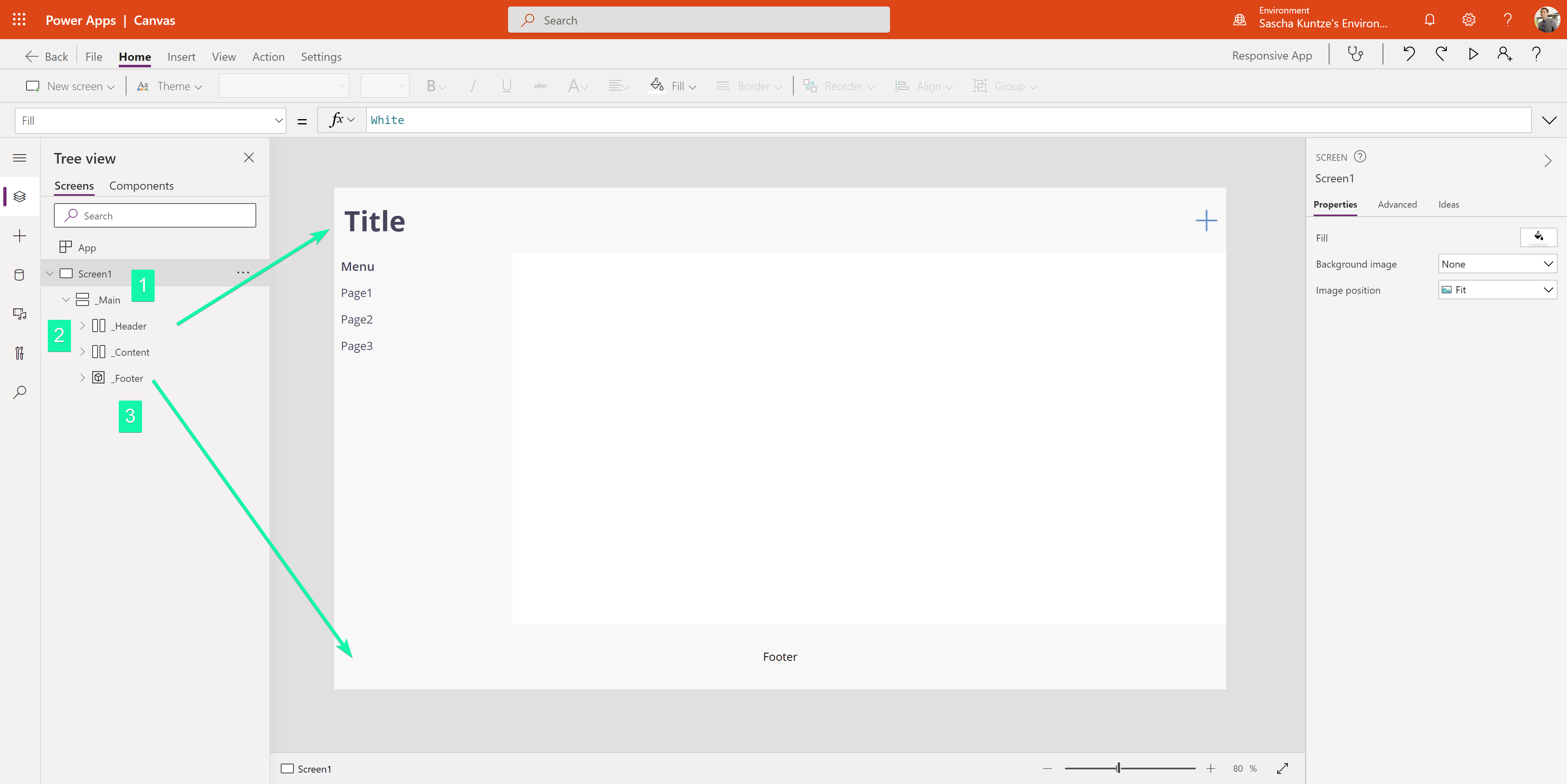
- Vertical Container - Stack elements or containers vertically
- Horizontal Container - Stack elements or containers vertically
- Container - Wrap certain elements
Use absolute heights for absolute heights
Whenever you want to have a fixed height at some elements or containers an absolute height needs to be specified. Otherwise, a relative layout could crash the dimensions of these containers. In the examples, the header container has a fixed height of 100 Pixels and the height of the content container is calculated.
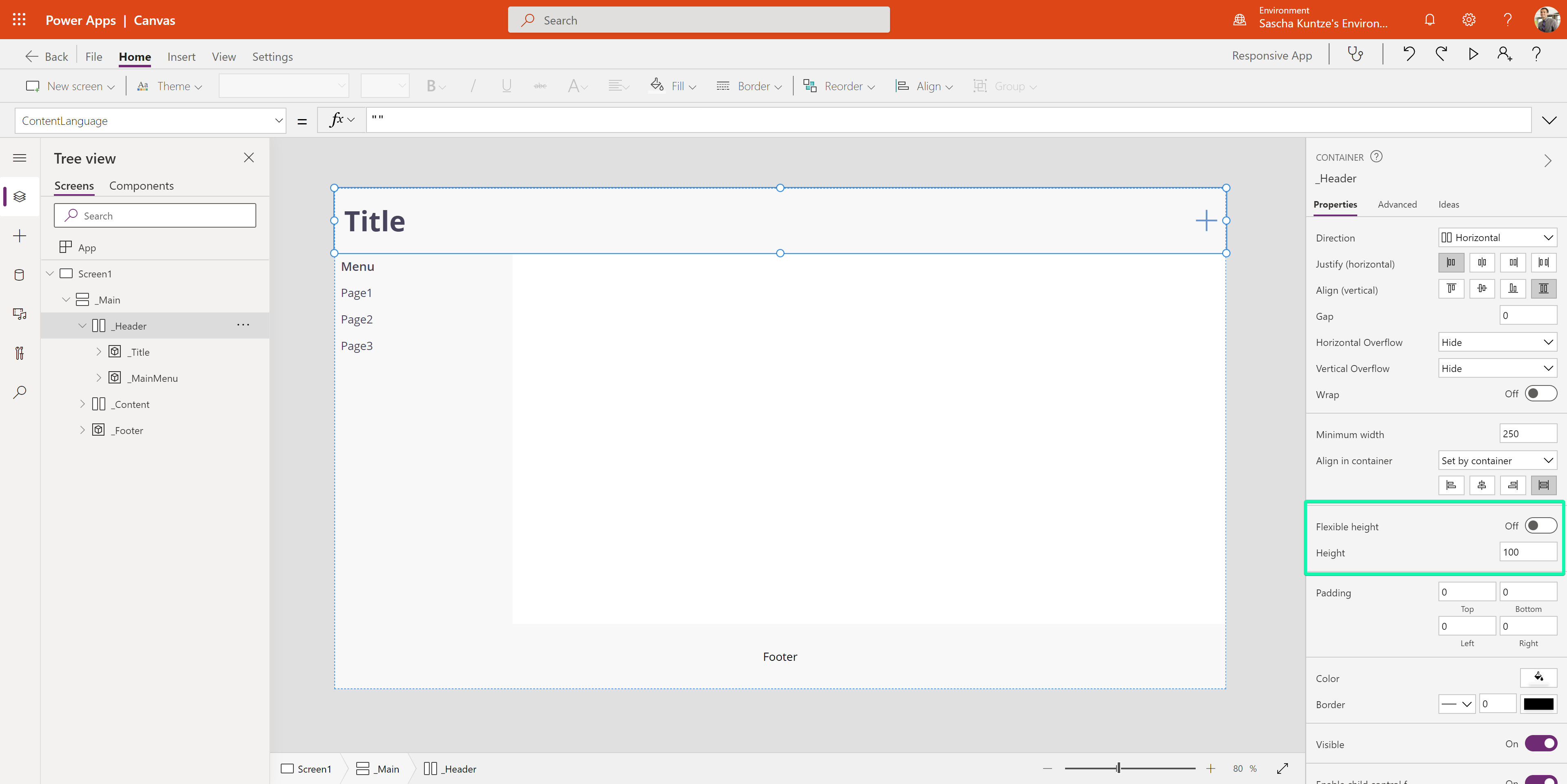
Use flexible heights for flexible heights
For containers, you can also specify a flexible height including the portions of the available space they are taking up. In this example, we have a fixed header (100 px) and the content (90 %) and footer (10 %) container are sharing the remaining space based on their portions.
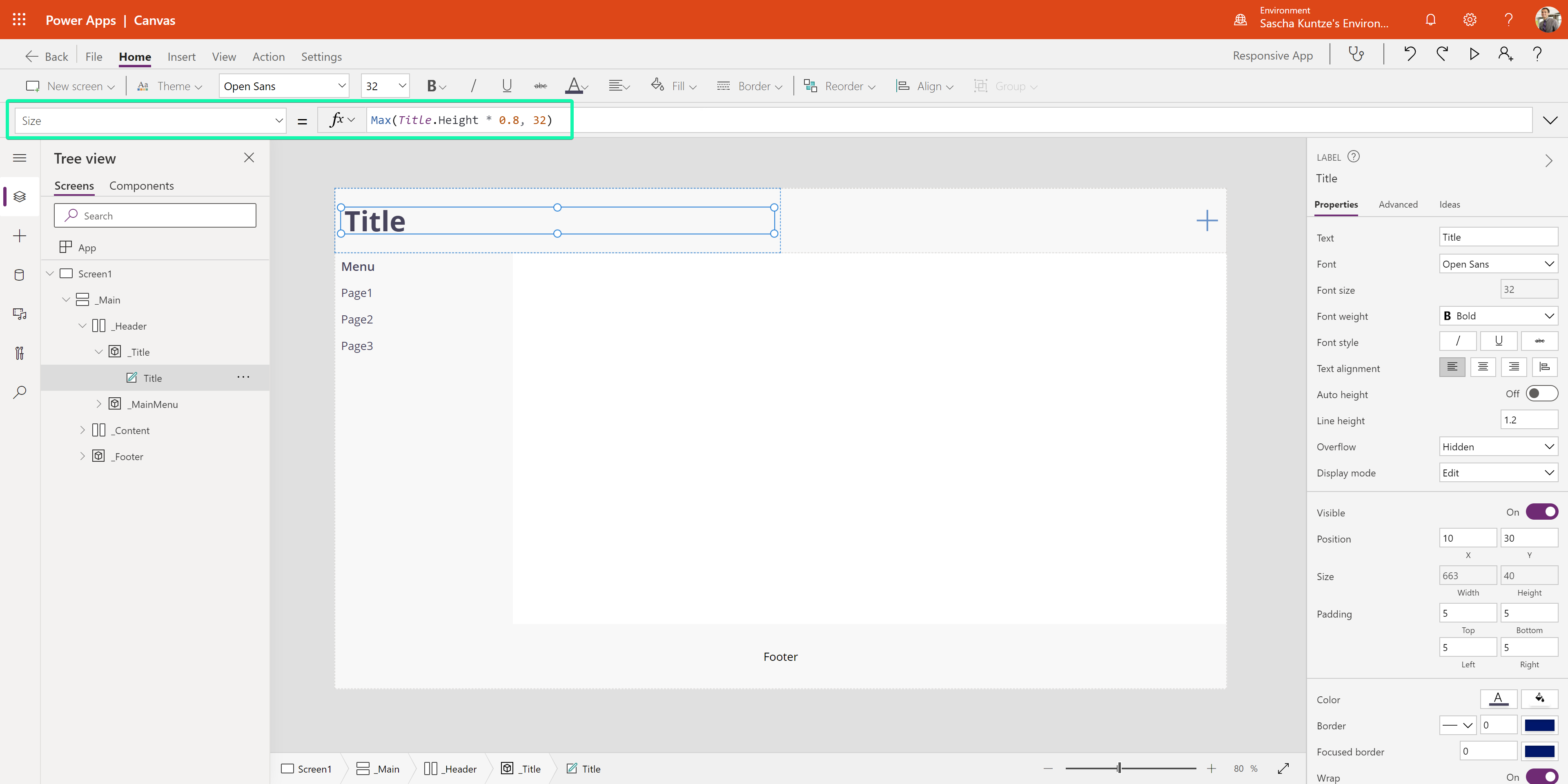
Remember to also set a minimum height so that your layout does not screw up on smaller screens. The height of the label should also be based on the Parent.Height.
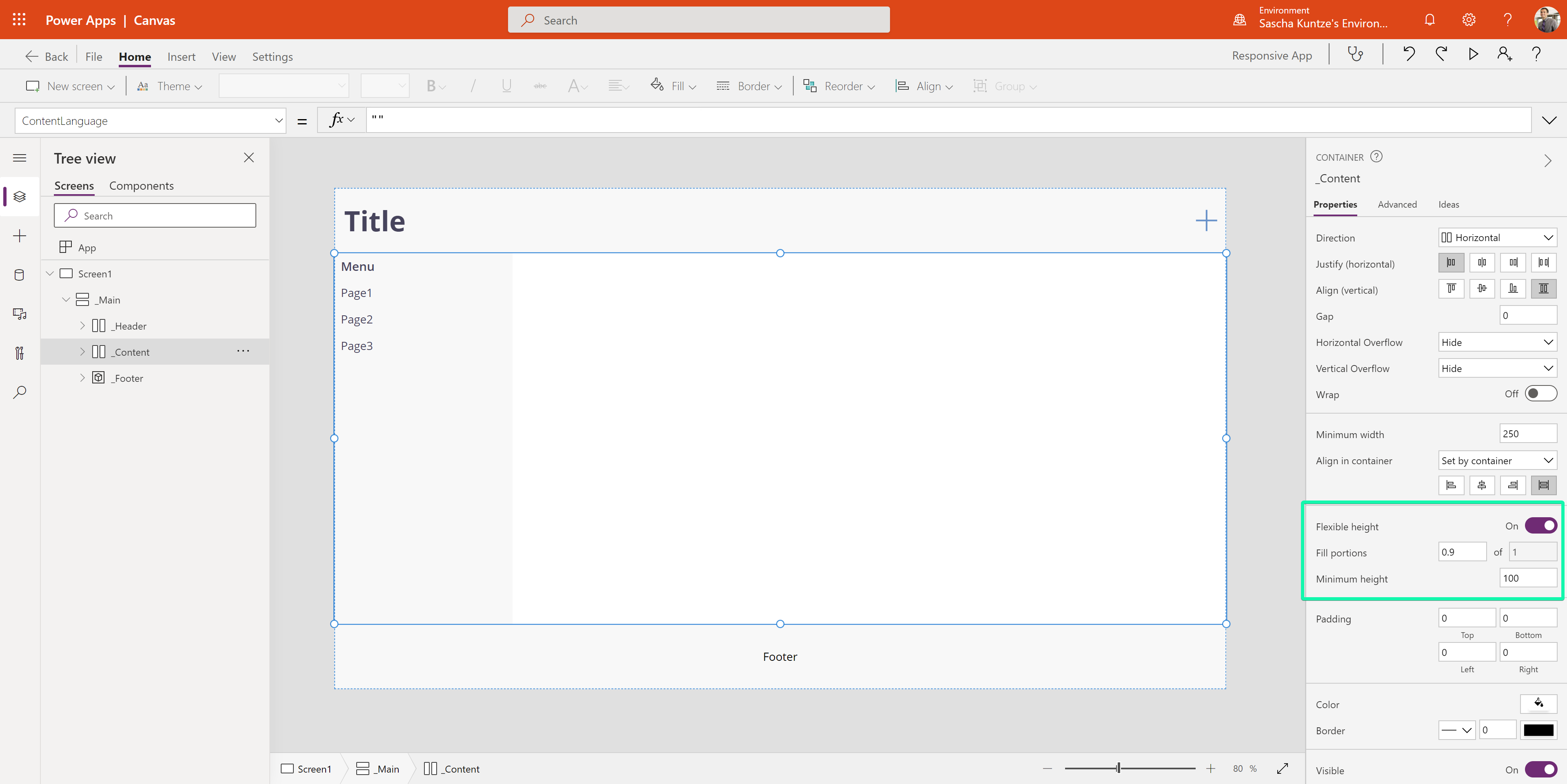
This also will be applied if you have specified an absolute height for a container which can be confusing. Usually I therefore also reference the Parent.Height so that I know that a relative height has already been taken care of.
Use alignments for (child) elements
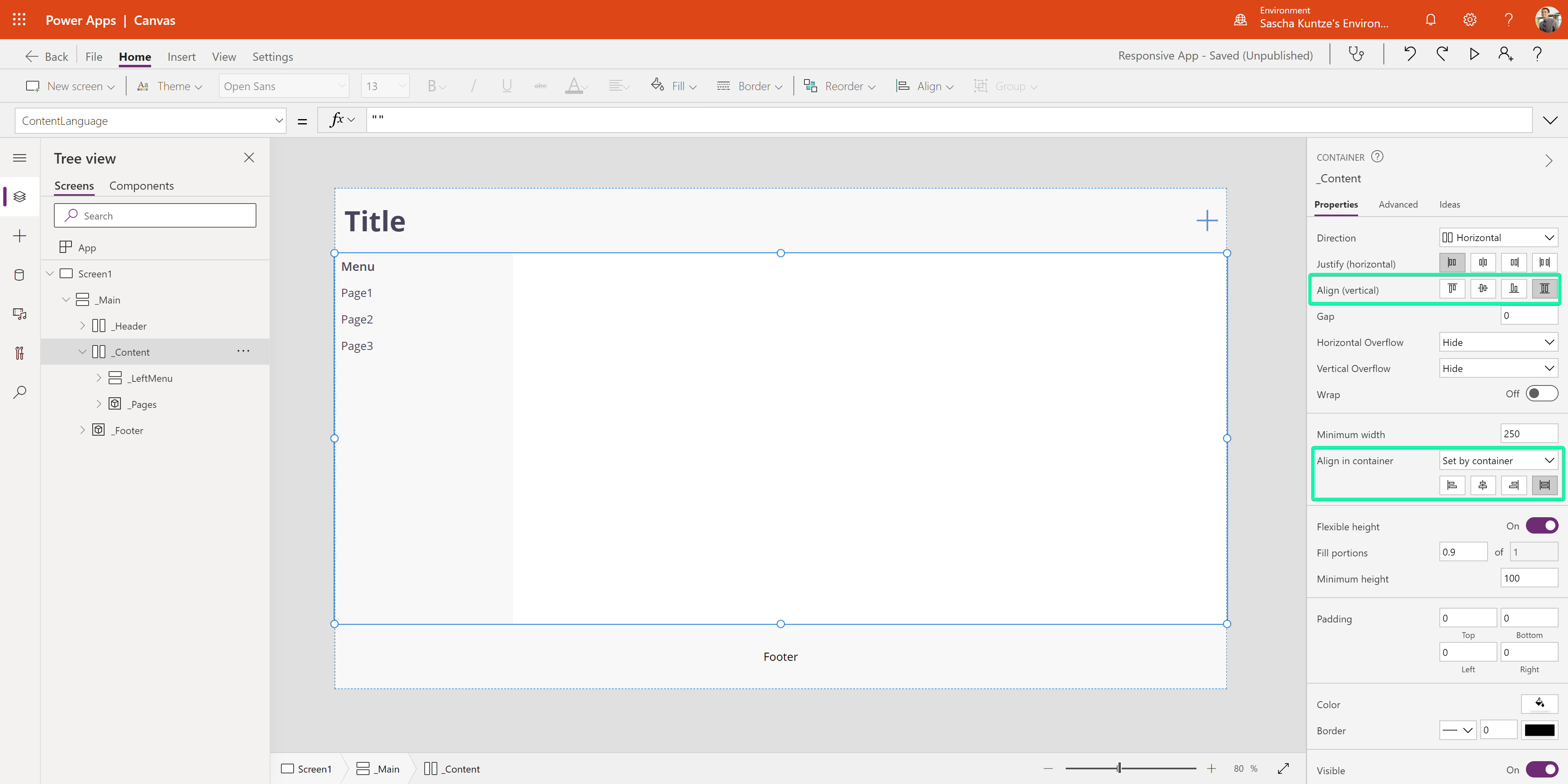
Whenever you create responsive containers make sure to specify the alignment so that the available space is filled up properly.
In the following example, the container is configured to stretch vertically and horizontally.
Use relative heights and widths everywhere
We have already looked at the heights in detail. The same applies to the widths of course. Specify absolute sizes only if necessary and use relative sizing / responsive container alignments everywhere else. A single absolute value could potentially screw up the responsive layout.
Testing your layouts
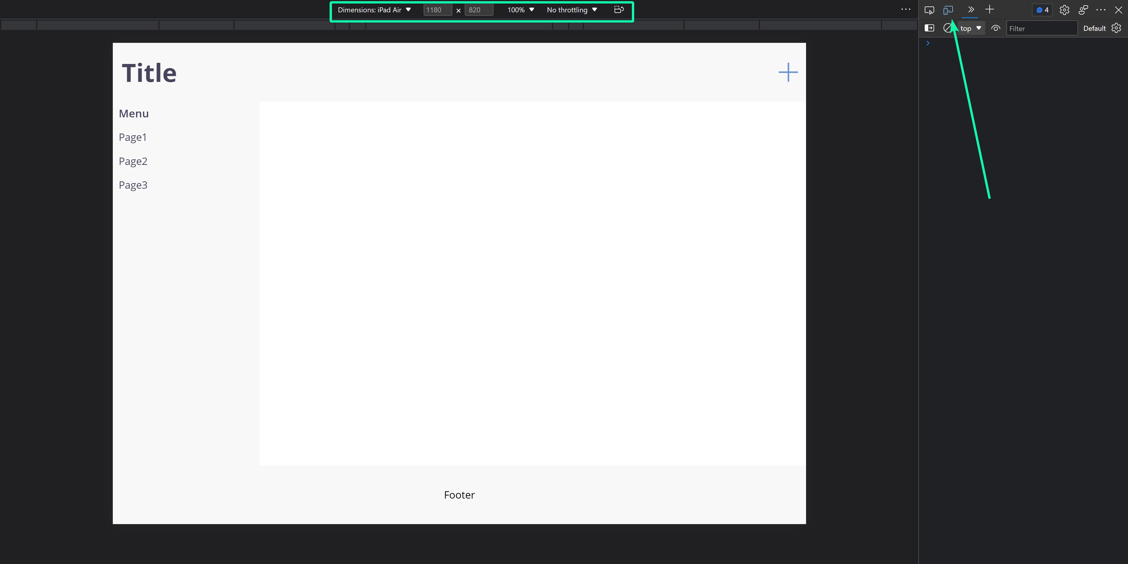
You can use the Developer Tools of all modern browsers for testing your layouts. Open the Device Emulation inside the Dev Tools. There are already some of the dimensions pre-configured but you could also specify your own. Also, you can change the screen orientation through the toolbar on the top of the emulation window.
The following screenshot shows a Canvas App with Dev tools opened. But the same applies to (embedded) Custom Pages. There you can also hide the purple navigation bar of the Maker portal by appending &hideNavbar=true onto the URL.
More to consider
-
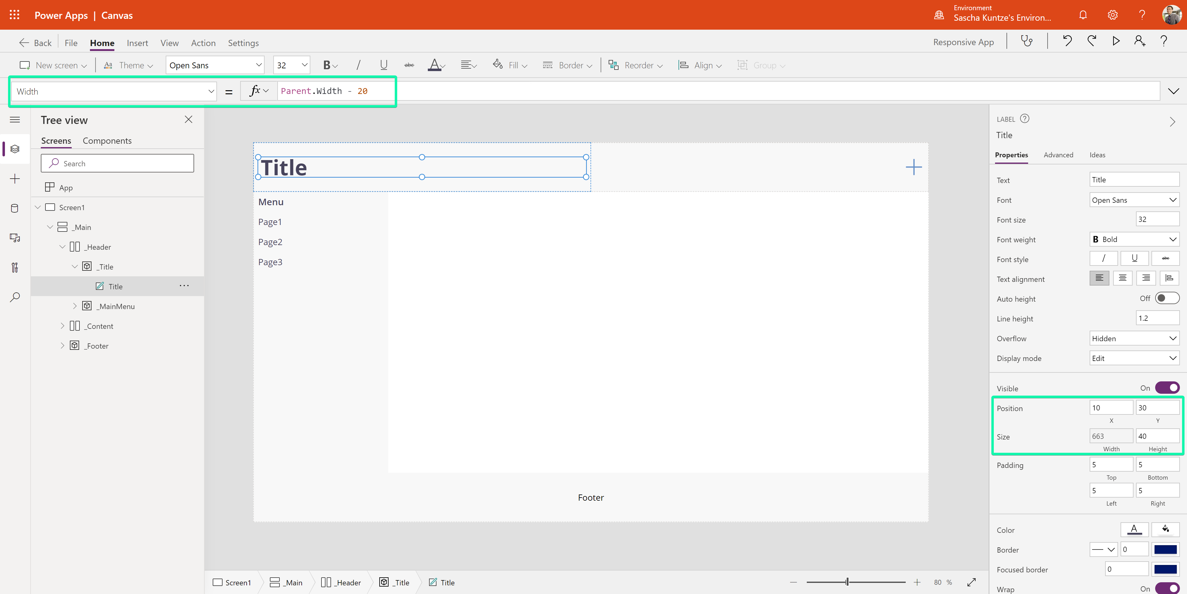
Calculating the X and Y values of containers or elements (e.g. for applying left and right paddings of 10 px) and a relative width
-
Use the configuration of wrapping containers and their heights for relative font sizes (but maybe set a minimum width as well)
- Use flyout menus on small screens
Conclusion
The editor experience provides everything you need for building responsive Power Apps. Start by choosing the general display settings and make sure that you have explicitly updated every height and every width of every container or element.
Need help with your responsive Power Apps? Feel free to send me an email!


